
General Web Accessibility Training Recap
This foundational course covers the core principles and techniques needed to create accessible digital content across multiple platforms. Whether you're creating websites, documents, presentations, or course materials, these skills will help you meet WCAG 2.1 AA standards and the April 24, 2026 DOJ Title II compliance deadline.
Training Recording
Date: February 3, 2026
Duration: 1 hour, 19 minutes
Presenter: Jeff Luman, Digital Accessibility Team
Classroom Resources
Classroom Presentation
Download the full slide deck covering foundational digital accessibility concepts and WCAG 2.1 standards.
View Presentation
Alt Text Decision Tree
An interactive guide to help you choose the correct alternative text for images based on their context.
View GuideAccessibility Checklist
A "Top 10" pre-flight checklist to ensure compliance for your documents and web pages.
View ChecklistWhat This Course Covers
This training introduces the foundational knowledge you need to create accessible digital content at Texas Tech University. The concepts below apply to web pages, documents, presentations, PDFs, and social media. By the end, you should be able to identify common accessibility barriers in your content and apply practical techniques to remove them.
All content at Texas Tech must meet WCAG 2.1 AA standards by the April 24, 2026 DOJ Title II compliance deadline. The WCAG organizes its success criteria under the four principles above, commonly remembered as POUR. Every technique covered in this training maps back to one or more of these principles.
Key Takeaways
Heading Structure
Think of headings like outlining a paper. Heading 1 is what the whole page is about. Heading 2s break it into logical chunks. If a chunk needs further segmenting, that is where Heading 3 comes in. When you outline your content this way, screen reader users can jump to the section they need, the same way a sighted user visually scans the page and skips to what interests them.
Alternative Text
Context is everything with alt text. The same image on two different pages may need
two completely different descriptions, because it depends on what information you
are trying to convey. Decorative images that add no new information get empty alt
text (alt="") so assistive technology skips right past them. For complex images like charts or
flowcharts, provide a brief label and a longer description in the surrounding page
content.
Descriptive Links
Here is a quick test: if you read just the link text with blinders on and see nothing else on the page, do you know where that link is taking you? If the answer is no, it needs rewriting. "Click here" tells a screen reader user nothing. Descriptive links also give your users a larger click target, and they help search engines understand what your page is about.
Color Contrast
Unlike alt text, color contrast is not subjective. It is a yes-or-no check. WCAG 2.1 AA requires a minimum ratio of 4.5:1 for normal text and 3:1 for large text. The WebAIM Contrast Checker will tell you in seconds whether your colors work. And remember, never use color as the sole way to communicate meaning. Always pair it with a text label, icon, or pattern.
Semantic Structure
When a screen reader hits a properly marked-up list, it tells the user something like
"list with 7 items," and right away they know what they are working with. That context
disappears when you fake a list with dashes or line breaks. The same goes for emphasis:
use <strong> and <em> so assistive technology can convey the intended meaning, not just visual styling.
Accessible Tables
Tables should only hold actual tabular data, never be used for layout. Every column
needs a proper header cell with a scope attribute so screen readers can announce which header applies to each data cell.
But here is the main takeaway: a lot of content that ends up in tables does not need
to be a table at all. If a simple heading and a bulleted list can do the job, that
is almost always the more accessible choice.
Keyboard Navigation
Tab through your content. Watch where the focus goes. Is it predictable? Does it follow the visual reading order? Can you always tab back out? Some of our users interact with content exclusively through the keyboard, a mouth stylus, eye-tracking software, or other input devices. If something on your page is not reachable by the Tab key, it is a barrier we need to remove.
Captions and Audio
Every video needs accurate captions, and the standard is 99% accuracy. Automated captions are a starting point, but they must be reviewed and corrected before publishing. Transcripts are helpful, but they do not replace captions. And here's one that catches people off guard: if your video shows visual information you do not describe out loud, a separate descriptive audio track is now required.
PDF Awareness
PDFs are the final boss of accessibility. They can be very tricky to remediate, and we have avalanches of them across the university. Before you start fixing a PDF, ask yourself: do I still need this? Can I archive it? Can I convert it to HTML instead? When a PDF is truly necessary, it needs proper tagging, correct reading order, and alt text for all images.
Concepts in Detail
The Curb Cut Effect
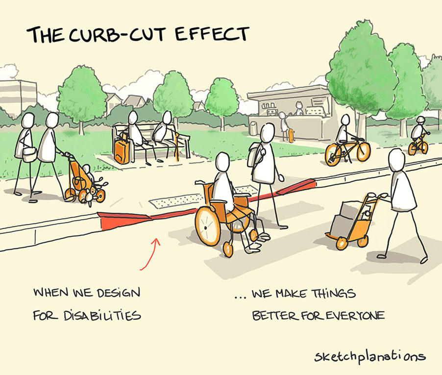
We like to start here because it reframes the whole conversation. A curb is a barrier. When we cut it out, we did not just help one group of people. We helped parents pushing strollers, travelers with luggage, delivery workers, cyclists, skateboarders, and a whole litany of others we may not have been thinking about. Well-thought-out design, properly implemented, benefits far more people than we realize.
Digital accessibility is the same idea. When we require a mouse to navigate a website, we have built a digital curb. By allowing keyboard navigation, we are not focusing on a user's limitations. We are fixing the usability of our product for everyone. That is one of the hallmarks of really good accessible design: it is not a reductive process where we remove things. We are removing barriers by adding accessible content.
Headings as an Outline
If you are a sighted user, you might visually scan a long page, decide which section looks interesting, and jump straight there. We want to provide that same experience for everybody. A screen reader user can pull up a list of all headings on the page and navigate directly to the one they need, but only if we have structured our headings correctly.
Think of it like outlining. Heading 1 is what the page is about, and in practice, you should have one Heading 1 on the page. Heading 2s break the page up into logical chunks. If that chunk needs to be further segmented, that is where your Heading 3 comes in. And if that Heading 3 block needs to be further segmented, there is your Heading 4. In realistic practice, that is about the depth most content requires.
One important rule: never select a heading level because you like how it looks. A Heading 5 should not appear on your page just because you prefer the font size. Use CSS or your editor's styling to control visual appearance. The heading level must reflect the logical structure, so assistive technology can present it accurately.
Alt Text and Context
Context is the key to good alt text. The same image, depending on where it appears, will have vastly different descriptions. A photo of a university server rack in a student brochure might call for something like "A student connecting to a cable in a modern data center." But the same photo in an IT incident report? Maybe the alt text should be "Server rack model E12 with a red indicator light blinking on the third storage array." What is the image trying to convey? That is the question you always come back to.
For decorative images that carry no new information, the answer is simpler. Use alt="", which is an empty alt attribute with nothing between the quotation marks. This tells
assistive technology to ignore the image entirely. Common examples include generic
stock photos added just for visual appeal, border graphics, divider lines, and icons
that already have descriptive text next to them. A picture of the campus on an IT
guide page about file transfers? That is decorative. You just put it there to add
some visual pizzazz.
Complex images are a beast unto themselves. Graphs, charts, maps, diagrams, and flowcharts all need a brief identifying label as alt text and then a longer description present in the surrounding page content. For charts, a best practice is to include the actual data table the chart was generated from, so users can interact with either the visual or the data. For flowcharts, write out the decision points and flow as text, because the text locked inside an image is not searchable and not accessible.
Links That Make Sense on Their Own
Screen reader users can navigate a page by jumping from link to link, and the software will read them a list of all the links present. If every link on your page says "click here" or "read more," that list sounds like "click here, click here, click here, click here." That is not a usable experience for anyone.
The fix is straightforward: make the link text describe where the link is going. Instead of "To download the fall course guide, click here," make the link text itself say "Download the Fall 2026 Course Guide." A user reading just the link text should know where it takes them.
There is an added benefit you might not expect. Longer, more descriptive link text creates a larger surface area for clicking. If you have a person with a hand tremor or a mobility impairment, or even if you have just been on your phone trying to tap the right link and accidentally hitting the wrong one, that larger landing space makes a real difference. And search engines give extra weight to text in links and headings, so descriptive link text helps with discoverability too.
One more thing: we need to get out of the habit of pasting full URLs onto our pages. No screen reader user wants to hear an entire URL string read to them character by character, especially if it has a bunch of parameters. Hyperlink descriptive text instead.
Color and Contrast
This one is not touchy-feely or guessy. Color contrast is a yes-or-no check. Under WCAG 2.1 AA, you need a minimum contrast ratio of 4.5:1 for normal-sized text and 3:1 for large text (18 point or 14 point bold). You do not have to memorize those numbers, because tools like the WebAIM Contrast Checker will test your colors in seconds and tell you whether they pass.
For good and for bad, we are the Red Raiders, and that works against us sometimes. A lot of red-and-black color combinations just do not pass muster in terms of accessibility. Always test your specific color values before you commit to them. The checker has a color picker built in, so you can sample colors directly from your page if you do not know the hex codes.
Beyond contrast ratios, never rely on color alone to communicate meaning. If you have a student task list where green means "done" and red means "incomplete," a colorblind user cannot distinguish between them. The fix is not to remove the color, which can still be helpful for many users. Instead, add a text label alongside it. Was it signed for housing? It is red and says "Incomplete." Did they apply to Texas Tech? It is green and says "Done." Both channels of information are available for whoever needs them.
Tables: Simpler Is Better
Tables are not inherently great at accessibility, for a lot of reasons. They tend to be implemented poorly. For years, they were used for layout, which is really bad practice. They get linearized in ways people do not expect. And they need proper HTML headers and scopes applied to them before they are genuinely accessible.
When a table is necessary, make sure each column has a proper header cell (<th>) with a scope attribute indicating whether it applies to a column or a row. Include a summary so
screen reader users can get a quick sense of what the table contains without tabbing
through every cell. If they determine it is not relevant, they can skip straight to
the next section.
But here is the main takeaway: a lot of things that end up in tables do not have to be tables. If you have a simple list of names and attributes, that content might work better as a heading followed by a bulleted list. And if you have a complex table with nested or merged headers, consider splitting it into two or more simpler tables, each under its own heading. Two clean tables are almost always better than one complicated one.
Captions, Transcripts, and Descriptive Audio
Every video the university publishes must have accurate captions, and the standard is high: 99% accuracy. If you say 1,000 words, only 10 of them can be wrong. Automated captioning is a starting point, but it must be manually reviewed and corrected. That is one reason our training recordings do not go out immediately. The captions have to be vetted first.
Transcripts are useful and they serve an important role, particularly for deaf-blind users who may interact with content through a refreshable braille display. But transcripts do not replace captions. Think of them as complementary: captions are required, transcripts are helpful.
Descriptive audio is a newer standard that a lot of people are not yet familiar with. If there is information on the screen that you are not saying with your mouth, such as a formula, a chart, a demonstration, or any visual element that matters, you need a separate audio track that describes what is happening. If you want to see this done well, go to Netflix and choose the audio description track for a movie. You can close your eyes and follow along like it is an audiobook. The good news is that you can often avoid the need for a separate track entirely by simply describing your visuals as you present them.
PDF Remediation Strategy
PDFs are, candidly, the final boss of accessibility at Texas Tech. We have avalanches of them, and every time we think we get one thing remediated, ten more spring up. But before you start fixing a PDF, take a step back and run it through a decision process.
First: do you still need it? If a student searching the web found a 2018 flyer on Google today for some event you had back then, would it help or confuse them? Old policies, old newsletters, expired forms: if they are not being stored for research or informational purposes, start getting rid of them. Your users are looking for answers, not archaeology.
Second: if you do need it, can you convert it to HTML? A native HTML page is inherently more accessible than a PDF, and it is what we should be moving toward wherever possible.
Third: if it must stay a PDF, it needs proper tagging (heading structure, lists, table headers), correct reading order, alt text for all images, and should pass the Adobe Acrobat accessibility checker. Documents created before the compliance deadline that serve only archival or reference purposes may qualify for an archive exception.
Social Media Accessibility
The April 24, 2026 deadline applies to social media too, with the same standards as
everything else. From that date forward, all new social media posts need to be accessible.
Images need alt text. Videos need accurate captions. And hashtags should use camel
case, capitalizing the first letter of each word (#AccessibilityIsForEveryone instead of #accessibilityisforeveryone), so screen readers know how to break up the words instead of reading the whole thing
as one long string.
The one piece of good news: old social media content is considered ephemeral. Unlike older web content that is still live and serving a purpose, social media is a product of its time. You do not have to go back and reimagine all your past posts as accessible content. Just make sure everything from the 24th forward meets the standard.
Tools Referenced in This Training
Digital Accessibility
-
Address
Texas Tech University, 2500 Broadway, Lubbock, TX 79409 -
Phone
806.742.3587 -
Email
digitalaccessibility@ttu.edu