Web Accessibility & WCAG 2.1

A Guide for Higher Education Professionals

Jeff Luman, Texas Tech University

jeff.luman@ttu.edu

What is Web Accessibility?

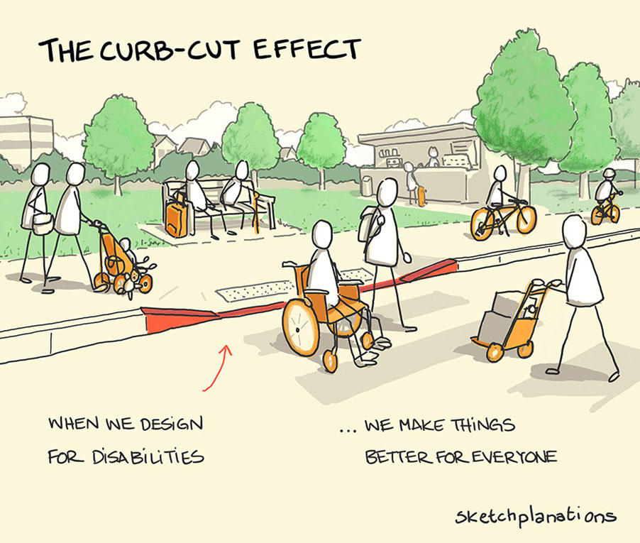
A cut in the curb allows many people to cross the street, including those using strollers, skateboards, wheelchairs, and rolling luggage.


Web accessibility is the practice of designing and developing websites so that everyone, regardless of ability, can perceive, understand, navigate, and interact with them. This involves ensuring that content is compatible with assistive technologies like screen readers, keyboard navigation tools, and voice recognition software.

To put it simply, modern design isn't about 'accommodating' specific people; it’s about fixing broken environments.

Think of the curb in the image. The curb itself was an artificial barrier—a design flaw that stopped movement. By cutting the curb, we didn't just help a wheelchair user; we removed an obstacle that was blocking parents with strollers, travelers with luggage, and delivery workers.

Digital accessibility is the same. When we require a mouse to navigate a website, we have built a digital curb. By removing that barrier and allowing keyboard use, we aren't focusing on a user's limitations; we are fixing the usability of our product for everyone.

Physical & Motor Disabilities

👀

Visual Impairments

👂

Hearing Impairments

🧠

Cognitive Disabilities

Accessibility for All: Key Considerations

Visual Impairments

  • Screen Reader Use: Provide text alternatives for all images, charts, and infographics. Use semantic headings and descriptive link text.
  • Color & Contrast: Ensure text color has sufficient contrast against the background for users with low vision or color blindness. Avoid using color as the only means of conveying information.
  • Readability: Use clear, legible fonts and allow text to be resized to 200% without loss of content or functionality.

Hearing Impairments

  • Captions & Transcripts: All video content must have accurate captions. Provide a transcript for audio-only content (like podcasts).
  • Audio Descriptions: For videos with important visual information, provide an audio description track or a transcript that describes the visuals.

Physical & Motor Disabilities

  • Keyboard Accessibility: All functionality must be operable using a keyboard alone. This is critical for users who cannot use a mouse.
  • Sufficient Time: Don't time out forms or content unless absolutely necessary. If a time limit is required, allow the user to extend or turn it off.
  • Large Clickable Areas: Buttons and links should be large enough to be easily clicked or tapped, reducing the chance of error.

Cognitive Disabilities

  • Clear Language: Write clearly and concisely. Avoid jargon and complex sentences.
  • Predictable Navigation: Keep navigation consistent throughout the website. Ensure labels and buttons have a predictable function.
  • Error Prevention: Provide clear instructions and helpful error messages for forms. Allow users to correct their input easily.

The Four Principles of WCAG 2.1

The guidelines are built on a simple acronym: POUR

Perceivable

Can users perceive the information? (e.g., alt text for images, captions for video)

Operable

Can users operate the interface? (e.g., keyboard navigation, no keyboard traps)

Understandable

Is the content and interface understandable? (e.g., clear language, predictable navigation)

Robust

Can content be interpreted by a wide variety of user agents? (e.g., compatibility with screen readers)

Accessible Text: Your Foundation

Text likely makes up the bulk of the content on your webpage. There are many things you can do to promote accessibility with the text on your page.

Using Headings

In editing your website, you may notice that you have access to a variety of heading formats, typically from "Heading 1" through "Heading 6". It is critical that these are not used purely for stylized elements, though. As an example, you shouldn't use a "Heading 5" at a given place on your site purely because you like how it looks. Similarly, if you set a given bit of text to be bold or have a larger font size, you likely should consider making that bit of text a heading of the appropriate level.

In designing your webpage, you should think of the page's content as being part of an outline. The heading elements are used to break up the various levels of that outline, with "Heading 1" typically being the title of the page. Here, for example, this text you are reading now is under a "Using Headings" heading 3, which falls under the page's "Accessible Text" heading 2.

Links

Links on your webpage will have two main components. The target of your link would be the URL that users are going to (or the email address they are mailing) once they click that link. The second main component is the text that you show to users. The text you show to users should be descriptive of where that link is going. A user should be able to quickly glance at your page and say "oh, there was a link going to Rawls" or something similar. Using text like "Click Here" or "Read More" provide no context for where a link is going. Screen reader users can navigate a page by jumping from one link to another, and 30 links that all say "Read More" can be very confusing. Nobody does a Google search for "Click Here", so why is that the text in your link?

Where possible, avoid having links open in a new tab. Opening links in a new tab takes away a user's ability to decide how they want to open links. If you must open a link into a new tab, add "(opens in a new tab)" to the text of the link.

Text Appearance

The general appearance of text on your webpage is likely covered already by the TTU Template. We have designed this template to meet accessibility requirements, but you may want to adjust the size, spacing, and color of text on sections of your page. In addition to following university identity guidelines, there are some accessibility considerations you should make.

The text on your page should have sufficient contrast with its background. The WebAIM Color Contrast Checker is a great tool to confirm this. A user should be able to zoom in on the page or adjust the spacings of text on the page without losing any of the content.

Simplify Language

  • Simplify: Think about the language you use on your web page. Our students are coming from all over the world. They may be at varying stages of learning English, as could the parents, guardians, or friends assisting them in applying to college. Using simpler language can help more people understand the content of your web page. It is likely that pages describing complex topics would require more complex language, but even those could be simplified to increase their understandability.
  • Acronyms and Jargon: Defining acronyms and jargon used on your page can help users understand what those terms mean. We may know what FERPA, RRO, eRaider, or SBS mean, but many of our prospective students may not understand those terms. Define these terms the first time they are used on a page. Pronunciation guides can also help users that do not know these terms.
  • Text Language: If part of your site uses text in a language other than English, you should identify that language in the HTML of the element. This allows screen reading software to appropriately voice the text and can assist web browsers and other user agents in providing a sufficient dictionary or translation of the text.
  • Screen Reader Considerations: It is a good idea to test the text of your page with screen reading software to ensure it is read correctly. As an example, "8 a.m. - 5 p.m." could be read as something like "8 ah dot m 5 p dot m", where the "a" in "am" is read as "ah", the dots are voiced, and the dash separating the times is omitted. In this case, "8 AM to 5 PM" may work better. Screen readers may omit or improperly voice punctuation or special characters, so test any text you have with those to ensure they are voiced accurately.

Accessible Tables: More Than Just a Grid

When presenting data, the structure of your tables is crucial for screen readers. Let's look at some examples to see the difference.

A Very Bad Table

At a glance, it's hard to tell what this table is. All cells are formatted the same, with no clear distinction between headers and data. A screen reader would read this as one long, confusing string of text.

Dogs Breed Coat Color Cats Breed Coat Color
Fido Golden Retriever Golden Mittens Siamese Cream
Max German Shepherd Black/Tan Smokey Persian Gray

🚧 A Better, But Still Bad Table

By defining headers, we add some hierarchy and relationships, which makes it easier for a screen reader to announce the appropriate headers for each column. However, the nested headings for "Dogs" and "Cats" can be confusing.

<table>
<tr><th colspan="3" scope="colgroup">Dogs</th>
<th colspan="3" scope="colgroup">Cats</th>
</tr>
<tr> <th scope="col">Name</th> <th scope="col">Breed</th> <th scope="col">Coat Color</th> <th scope="col">Name</th> <th scope="col">Breed</th> <th scope="col">Coat Color</th> </tr> <tr> <td>Fido</td> <td>Golden Retriever</td> <td>Golden</td> <td>Mittens</td> <td>Siamese</td> <td>Cream</td> </tr> <tr> <td>Max</td> <td>German Shepherd</td> <td>Black/Tan</td> <td>Smokey</td> <td>Persian</td> <td>Gray</td> </tr> </table>
Dogs Cats
Name Breed Coat Color Name Breed Coat Color
Fido Golden Retriever Golden Mittens Siamese Cream
Max German Shepherd Black/Tan Smokey Persian Gray

Two Tables Are Better Than One

By simply splitting the data into two distinct, simpler tables, we can avoid the complex nested headings. Each table is now clean, logical, and easy for both sighted users and screen readers to understand.

<h3>Dogs</h3> <table> <tr> <th scope="col">Name</th> <th scope="col">Breed</th> <th scope="col">Coat Color</th> </tr> <tr> <td>Fido</td> <td>Golden Retriever</td> <td>Golden</td> </tr> <tr> <td>Max</td> <td>German Shepherd</td> <td>Black/Tan</td> </tr> </table> <h3>Cats</h3> <table> <tr> <th scope="col">Name</th> <th scope="col">Breed</th> <th scope="col">Coat Color</th> </tr> <tr> <td>Mittens</td> <td>Siamese</td> <td>Cream</td> </tr> <tr> <td>Smokey</td> <td>Persian</td> <td>Gray</td> </tr> </table>

Dogs

Name Breed Coat Color
Fido Golden Retriever Golden
Max German Shepherd Black/Tan

Cats

Name Breed Coat Color
Mittens Siamese Cream
Smokey Persian Gray

🏆 Is No Table the Best Table?

The best solution is often the simplest one. For this dataset, which is a simple list of names and types, an accessible table isn't even necessary. A simple list is easier to create and maintain and is inherently accessible.

<h3>Dogs</h3> <ul> <li>Fido: Golden Retriever, Golden coat</li> <li>Max: German Shepherd, Black/Tan coat</li> </ul> <h3>Cats</h3> <ul> <li>Mittens: Siamese, Cream coat</li> <li>Smokey: Persian, Gray coat</li> </ul>

Dogs

  • Fido: Golden Retriever, Golden coat
  • Max: German Shepherd, Black/Tan coat

Cats

  • Mittens: Siamese, Cream coat
  • Smokey: Persian, Gray coat

Accessible Images: A Picture is Worth 1,000 Words

Images can convey a lot of information on your page. A user with a vision impairment may not be able to gain this information. Since all users should get the same information and benefits from our pages, we must write descriptive text that conveys the meaning of images on our page.

How Descriptive is Descriptive Text?

The Masked Rider emerges from a puff of smoke and leads the TTU football team onto the field. A crowd of fans cheers in the background.

The detail used in the descriptive text of your image largely depends on the role that image plays within your website. For example, an image of the Masked Rider riding onto the football field conveys excitement and university pride. The image here is being used to convey excitement and university pride, which could be missed by a user that can't see the image. You'll want to make sure the meanings of your images are conveyed in the rest of the text on the page or in alt text associated with the image directly. If an image is serving a purely decorative role with no meaning or information to be had from the image, then you wouldn't need descriptive text. This is likely rare though, as there is usually some amount of information or emotion you are wanting to convey in the image used on your site.

This alt decision tree can help you decided how much descriptive text to write for your image.

Images with Text

If you have an image that contains text, there are a few things to consider. In creating that image, you must ensure there is sufficient contrast between the text of the image and its background. Placing text over a solid color background can facilitate this, as can using a contrasting outline around the characters of the text. Any text in the image must be duplicated either in the descriptive text of that image or as real text on the body of the page.
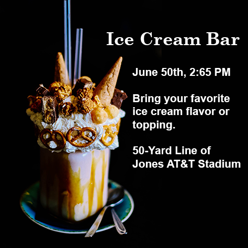
A milkshake topped with whipped cream, pretzels, caramel corn, candy bars, and mini cones.

Images as Links

When an image is a link, the alt text should describe the link's destination, not the image itself.

<a href="/admissions"> <img src="campus-photo.jpg" alt="Visit the Admissions page"> </a>

Don't write "Image of..." Unless...

Screen reading software will already announce an object as an "image". As such, your descriptive text does not need to include "Image of..." or "Photo of...". An exception of this would be if your website features artwork, especially with multiple mediums present on the same page. In that case, it is likely helpful to prefix your descriptive text with "Watercolor of..." or "Oil on canvas painting of..." to provide that additional context to your users.

Graphs & Educational Images

  • Graphs: The descriptive text should provide a general description of the data as well as any general trends present. It is a good idea to include a data table along with the chart to provide the full details for screen reader users.
  • Educational Images: Ensure you are still facilitating learning with the descriptive text. For example, instead of saying "A cat sitting in a cat tree," you could say "A small animal with fluffy grey hair, pointy ears, and whiskers. It sits in a home on top of a white, fuzzy platform." This requires the user to deduce the animal, just as a sighted user would.
Color & Contrast

Text used on your site should have sufficient contrast with its background. This applies to text as part of or overlayed onto images. The WebAIM Color Contrast Checker is a great tool to confirm this.

Contrast Ratio 2.92:1 This background (#CC0000, TTU Red) fails the contrast check.
Contrast Ratio 4.53:1 This background (#FF2424) passes the AA requirement.
Contrast Ratio 7.09:1 This background (#FF8080) passes the AAA requirement.

Use More Than Just Color

Color should not be the only way that meaning is communicated. As some users may have issues in differentiating and interpreting colors, it is always important to provide multiple ways to determine meaning from an object.

Bad Example: Student Tasks

  • Apply to TTU
  • Sign up for Housing
  • Submit FAFSA
  • Attend Orientation

Better Example: Student Tasks

  • Apply to TTU: Done
  • Sign up for Housing: Incomplete
  • Submit FAFSA: Incomplete
  • Attend Orientation: Done

Reading Order & Focus Management

The visual flow of a page doesn't always match the "tab" order. For keyboard and screen reader users, the logical order is everything.

Reading Order (Source Order)

The order that a screen reader reads content is determined by the order the elements appear in the HTML source code. It's critical that this logical order makes sense.

<!-- Source Order Matters --> <h1>Main Title</h1> <p>Paragraph 1 text...</p> <p>Paragraph 2 text...</p> <!-- The browser renders this correctly, but if you reorder it in the source code, a screen reader will follow the new order. -->

Focus Management

Keyboard users navigate a page by tabbing through interactive elements. The "focus" is the visual indicator of the currently selected element.

  • Visible Focus: The default browser outline on focusable elements like links and buttons is a required accessibility feature. Don't remove it with CSS!
  • Logical Focus Order: The tab order should follow the visual reading order of the page.
  • Keyboard Traps: A "keyboard trap" is when a user tabs into a component but cannot tab out. This is a severe accessibility issue.

Forms: A Two-Way Conversation

Forms are a primary way for users to interact with your site. Proper form design is crucial for a smooth and accessible experience.

The Importance of Labels

The single most important rule of accessible forms is to properly associate a label with its form input. This is done using the `

Bad Practice: No Associated Label

Without a `

<p>Your Name</p> <input type="text" id="name-field">

Good Practice: Use a <label>

The `for` attribute on the `

<label for="name-field">Your Name</label> <input type="text" id="name-field">

Other Best Practices for Forms

  • Error Handling: Provide clear, specific, and visible error messages when a user makes a mistake. For example, "Email address is required" instead of just "Error."
  • Logical Tab Order: Ensure the `tabindex` is set to a logical order (or not at all, to follow source order) so keyboard users can navigate easily.
  • Correct Input Types: Use the right `` for the job (e.g., `type="email"`, `type="tel"`) to enable assistive technologies and mobile keyboards.

Social Media Accessibility

Accessibility isn't limited to web pages. Everything you create, from social media posts to emails, should be accessible.

Image & Video Content

  • Image Descriptions (Alt Text): Always add a descriptive alt tag to your images. This is the text a screen reader will read aloud.
    ✅ Good: A Texas Tech student sitting at a library table, studying.

    ❌ Bad: DSC002.jpg
  • Captions for Videos: All videos, whether live or pre-recorded, need accurate captions. This helps users with hearing impairments or those in loud environments.

Text & Hashtags

  • Camel Case for Hashtags: Use capital letters for each new word in a hashtag. This makes it readable for screen readers.
    ✅ Good: #AccessibilityIsForEveryone

    ❌ Bad: #accessibilityisforeveryone
  • Emoji Use: A screen reader reads out the full description of an emoji. Use them sparingly, and consider placing them at the end of a sentence or post so as not to interrupt the flow.

Accessible Audio & Video

Multimedia content on your website can help deliver information more efficiently and effectively than simple text or images. It's essential to ensure all users are able to receive the information contained within your audio and video elements. Generally, pre-recorded content has stricter guidelines than live content, though you should try to implement these recommendations whenever possible.

Content & Dialogue

  • Clear and Concise: Use clear, jargon-free language. Speak slowly and clearly. Avoid loud background music or noises that could conflict with your dialogue.
  • Describe Visuals: Describe any visual elements or actions in your dialogue. For example, instead of saying, "As you can see on this slide," say, "This slide shows a line graph of sales over time, indicating steady growth."

Captions & Subtitles

Captions provide a visual text alternative to a video's audio. They are essential for users with hearing impairments.

  • Timing and Flow: Captions should be accurate, synchronized with the audio, and easy to read. They should not exceed two lines and should be on screen for a minimum of 1.5 seconds and a maximum of 6 seconds.
  • Speaker and Sounds: Identify speakers and describe important non-speech sounds in square brackets, such as [dog barking] or [joyful music].

Automated captions are not sufficient for WCAG compliance and must be manually corrected. TTU Online Accessibility Services offers captioning assistance to faculty and staff.

Transcripts

Transcripts provide a text version of a video's speech and visuals. They are the only way for deaf-blind users to access the information.

  • Descriptive: A transcript should contain notes about both the audio and the visual components of a video. This includes descriptions of actions, scenes, and on-screen text.
  • Placement: Transcripts can be hosted on their own webpage, with a link placed near the related multimedia content.

The Accessibility Flow

Think of accessibility as a multi-step process to ensure all users have an equivalent experience.

Captions

Provide text for all spoken dialogue. Essential for those with hearing impairments.

⬇️
Transcripts

Add descriptive text for visuals. This is a critical step for deaf-blind users.

⬇️
Descriptive Audio

An additional audio track for videos with important visuals. This provides context for users with vision impairments.

⬇️
Sign Language

Consider adding a sign language interpreter for a more inclusive experience for those fluent in sign language.

Final Considerations

  • Descriptive Audio: If a video contains information not in the dialogue, a separate version with a descriptive audio track should be provided. This extra context should be placed in between dialogue gaps.
  • Sign Language: Including a sign language interpreter can provide a more comprehensive experience. When planning, remember to leave space in the video for the interpreter.

PDF Remediation: A Detailed Flow

PDFs can be tricky. Use this process to ensure they are accessible.

Step 1: Start with the Source

Always work from the original file (Word, InDesign, etc.). Making it accessible there is far easier than fixing a PDF.

  • Use built-in heading styles.
  • Provide alt text for all images.
  • Use the document's accessibility checker.

Step 2: Tag the Document

Tags are like the HTML structure for a PDF. They define headings, lists, tables, etc., so screen readers can interpret the content.

  • In Adobe Acrobat Pro, go to Tools > Accessibility > Auto-Tag Document.
  • For more complex documents, manually tag elements like lists, tables, and figures.

Step 3: Run the Accessibility Checker

This checker provides a report of accessibility issues. It will highlight a wide range of problems, from contrast to missing tags.

  • Go to Tools > Accessibility > Full Check.
  • The report will appear on the left, categorizing issues as "Passed," "Needs Manual Check," or "Failed."

Step 4: Remediate Manually

Some issues require human intervention. This is the most crucial step.

  • Reading Order: Check the "Order" panel to ensure the content reads logically. Drag and drop elements to correct the sequence.
  • Alt Text: Right-click on a figure tag in the "Tags" panel and add descriptive alt text.
  • Table Headers: Use the "Reading Order" panel to define table header cells (`TH`) and data cells (`TD`).

Helpful Tools of the Trade

Automated tools are a great starting point for finding accessibility issues.

WebAIM WAVE

A free, visual accessibility evaluation tool.

  • Identifies Errors & Alerts: Clearly flags issues like missing alt text and contrast errors directly on your webpage.
  • Shows Structure: Helps you visualize heading order and page regions to ensure a logical layout.
  • In-Browser Extension: Easy to run on any page, including password-protected pages or dynamic content.
Try WAVE Now

Color Contrast Checkers

Ensure your text is readable for all users, including those with low vision.

  • Checks Ratios: Verifies if your colors meet WCAG 2.1 AA standards (4.5:1).
  • Provides Fixes: Many tools suggest new colors if your combination fails.
  • Essential for Design: A must-use tool for any new design or branding.
Check Contrast

Start Your Accessibility Journey

Every step towards accessibility is a step towards a more inclusive and usable web for all.

Thank You!

For more  information please email jeff.luman@ttu.edu

© 2025 Texas Tech University

Feb 3, 2026