📊 Complex Images: Charts, Graphs, Maps, and Diagrams
Complex images require a two-part approach: a brief alt text that identifies the image type and purpose, plus a detailed long description that conveys all the meaningful data and insights.
The Two-Part Approach
1 Short Alt Text: Identify what type of visual it is and its main topic
2 Long Description: Provide all data, trends, and conclusions in accessible text format
Charts and Graphs
Charts and graphs present quantitative data visually. Users need both the specific data points and an understanding of what the data means.
Bar Charts and Column Charts
alt="Bar chart showing Q3 2025 sales by region"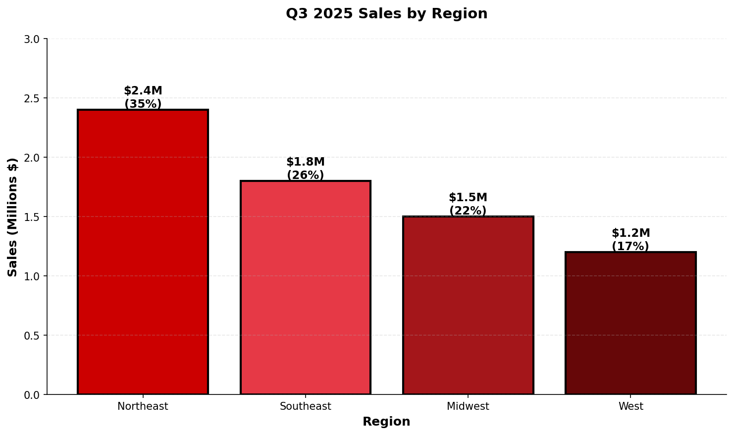
Long Description (on page, near image):
Q3 2025 sales performance by region:
• Northeast: $2.4 million (35% of total)
• Southeast: $1.8 million (26% of total)
• Midwest: $1.5 million (22% of total)
• West: $1.2 million (17% of total)
Key insight: Northeast region leads in sales with a 35% market share, while the West region shows opportunity for growth at 17%.
Pie Charts
alt="Pie chart of student enrollment by college"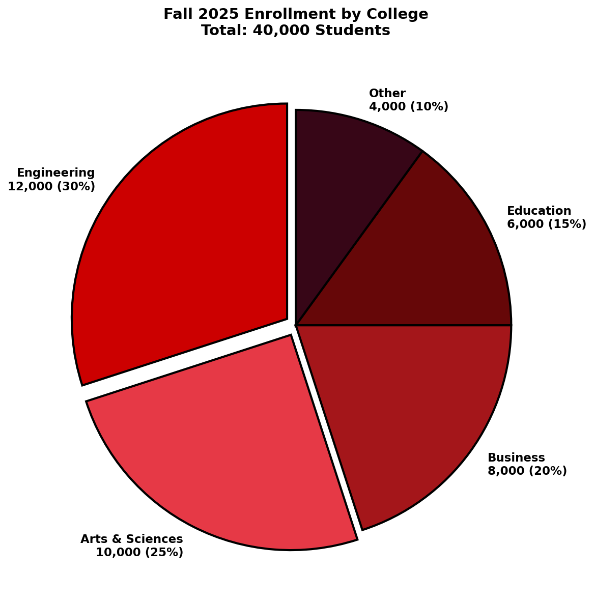
Long Description:
Fall 2025 enrollment breakdown across colleges (total: 40,000 students):
• College of Engineering: 12,000 students (30%)
• College of Arts & Sciences: 10,000 students (25%)
• College of Business: 8,000 students (20%)
• College of Education: 6,000 students (15%)
• Other colleges: 4,000 students (10%)
Engineering and Arts & Sciences together account for over half of total enrollment.
Best Practices for Charts and Graphs
- Always include actual data values, not just visual descriptions
- Explain trends, patterns, or relationships shown in the data
- Identify the highest and lowest values when relevant
- State the time period or categories being compared
- Mention units of measurement (dollars, percentages, counts)
- Consider providing a data table alongside complex visualizations
Maps
Maps present spatial or geographic information. The level of detail needed depends on the map's purpose.
Campus Maps: Designated Outdoor Safe Meet Areas (DOSMAs)
alt="Map of Designated Outdoor Safe Meet Areas and Blue Light Emergency Phones for the Engineering and Athletics district."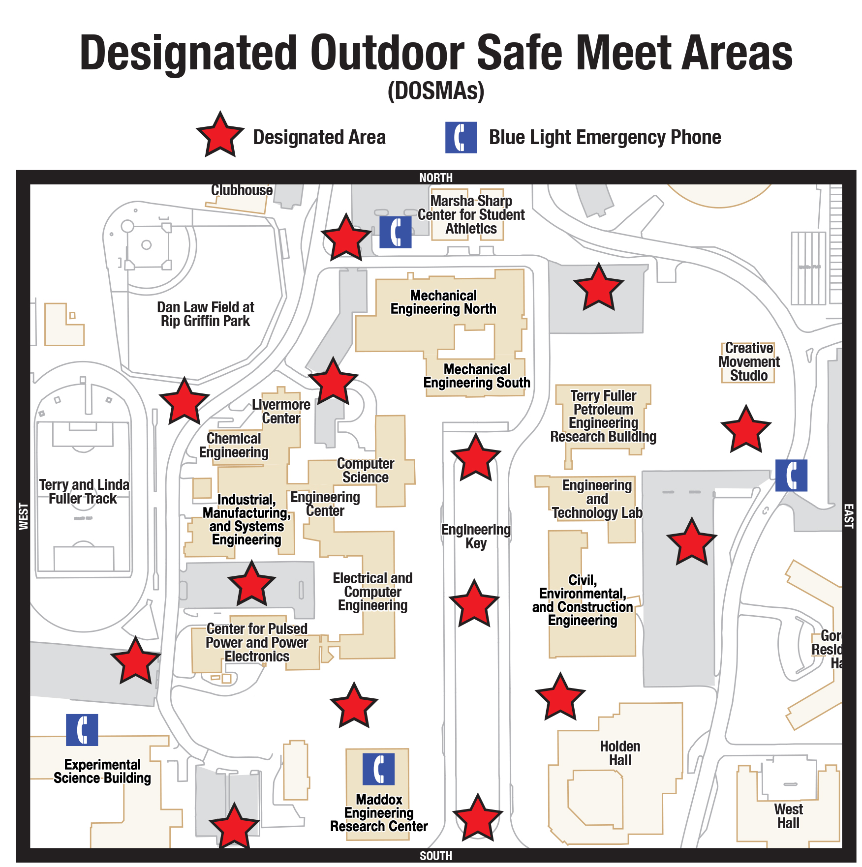
Long Description (Integrated Accessibility):
This map identifies 15 Designated Outdoor Safe Meet Areas (red stars) and 4 Blue Light Emergency Phones (blue phone icons) throughout the Engineering and Athletics district.
Blue Light Emergency Phone Locations
- West of the Marsha Sharp Center for Student Athletics.
- Inside the Experimental Sciences Building.
- Inside the Maddox Engineering Research Center.
- East of the Engineering and Technology Lab.
Designated Outdoor Safe Meet Areas (15 Locations)
Northwest Quadrant
- West of the Marsha Sharp Center for Student Athletics.
- Southwest of Mechanical Engineering North.
- West of Chemical Engineering and the Livermore Center.
- South of the Industrial, Manufacturing, and Systems Engineering building.
Southwest Quadrant
- West of the Electrical and Computer Engineering building.
- West of the Center for Pulsed Power and Power Electronics.
- East of the Experimental Sciences Building.
- North of the Maddox Engineering Research Center.
Engineering Key (Central Section)
- North Key: East of Computer Science.
- Central Key: East of the Engineering Center.
- South Key: South of the Engineering Key walkway (near South perimeter).
Northeast and Southeast Sections
- Northeast: Immediately East of Mechanical Engineering North.
- Northeast: South of the Creative Movement Studio.
- East Central: South of the Terry Fuller Petroleum Engineering Research Building (West of the Engineering and Technology Lab).
- Southeast: West of Holden Hall (East of the Civil, Environmental, and Construction Engineering building).
Diagrams and Flowcharts
Diagrams show relationships, processes, or structures. Users need to understand both the components and how they connect.
Process Flowcharts
alt="Flowchart of the course withdrawal process"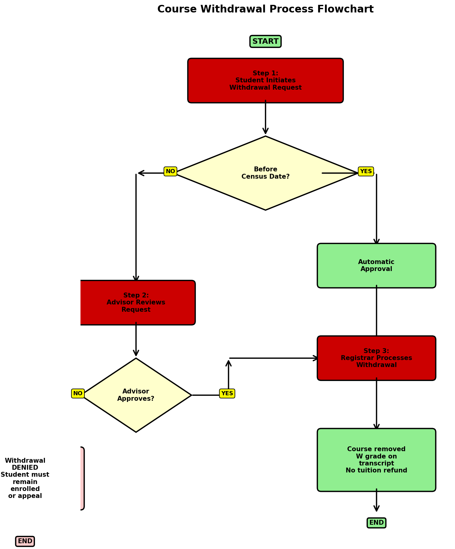
Long Description:
Course Withdrawal Process:
Step 1: Student initiates withdrawal request
Decision point: Is it before the census date?
• If YES → Proceed to automatic approval (go to Step 3)
• If NO → Requires advisor approval (continue to Step 2)
Step 2: Advisor reviews request
Decision point: Does advisor approve?
• If YES → Proceed to Step 3
• If NO → Withdrawal denied, student must remain enrolled or appeal
Step 3: Registrar processes withdrawal
Result: Course removed from schedule, W grade recorded on transcript
Final outcomes:
• Approved withdrawal: W on transcript, no tuition refund after census
• Denied withdrawal: Student remains enrolled, must continue attending or appeal decision
Organizational Charts
alt="Organizational chart for IT Accessibility Services department"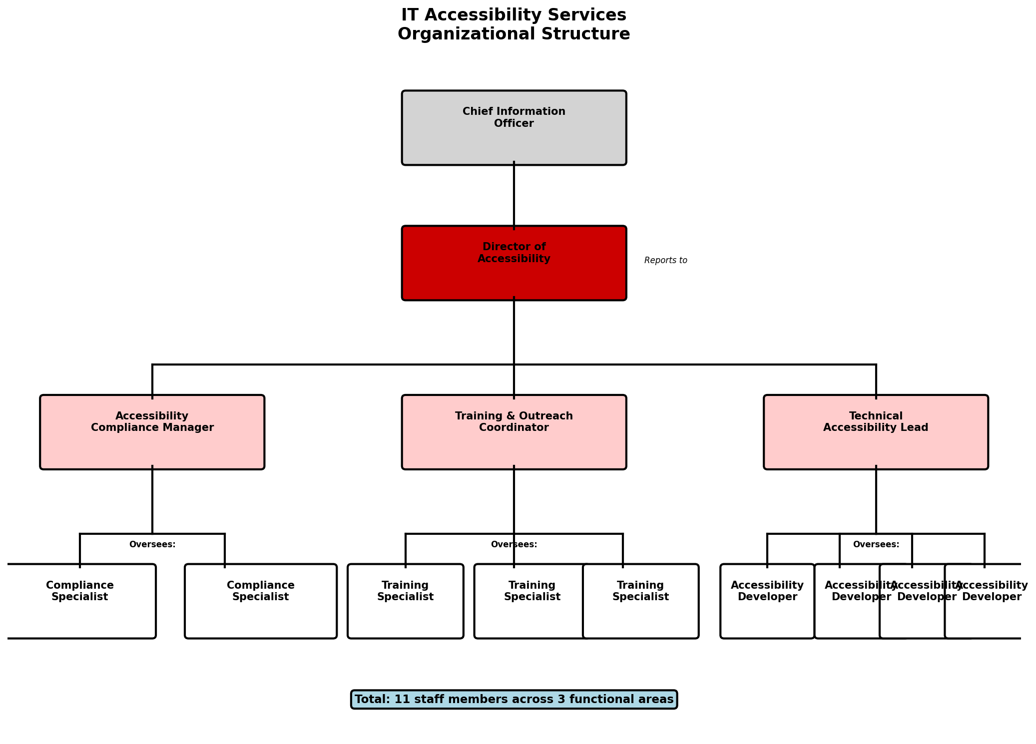
Long Description:
IT Accessibility Services organizational structure:
Director of Accessibility (top level):
Reports to: Chief Information Officer
Direct reports to Director:
1. Accessibility Compliance Manager
• Oversees: 2 Compliance Specialists
2. Training and Outreach Coordinator
• Oversees: 3 Training Specialists
3. Technical Accessibility Lead
• Oversees: 4 Accessibility Developers
Total department size: 11 staff members across three functional areas focused on compliance, education, and technical implementation.
Technical Diagrams
alt="Network architecture diagram showing TTU's accessibility testing infrastructure"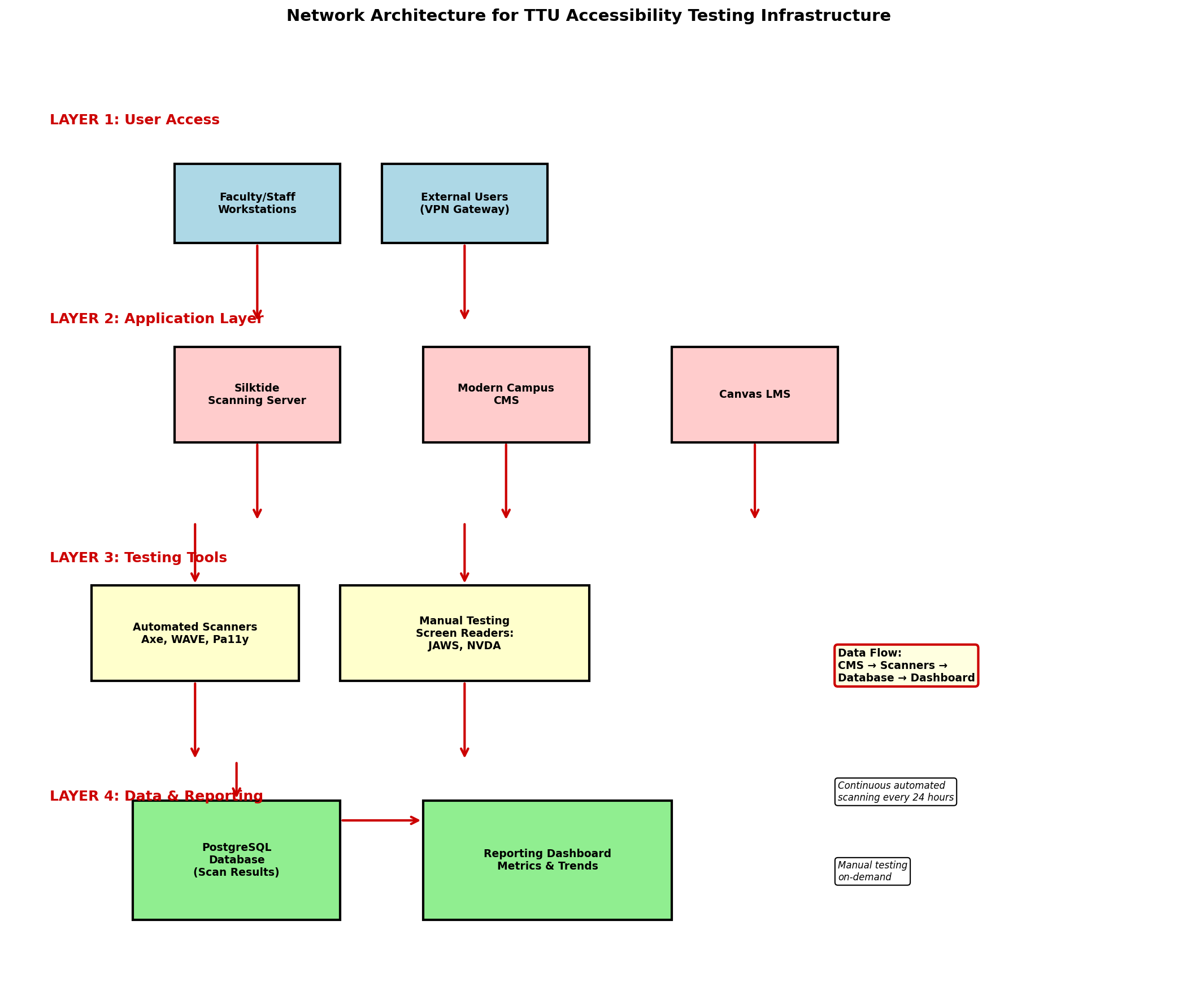
Long Description:
Network Architecture for Accessibility Testing:
Layer 1 - User Access:
• Faculty/Staff workstations connect via campus network
• External users connect through VPN gateway
Layer 2 - Application Layer:
• Silktide scanning server (monitors all public web pages)
• Modern Campus CMS (content management)
• Canvas LMS (learning management system)
Layer 3 - Testing Tools:
• Automated scanners: Axe, WAVE, Pa11y
• Manual testing station with screen readers (JAWS, NVDA)
Layer 4 - Data Storage and Reporting:
• PostgreSQL database (stores scan results)
• Reporting dashboard (displays metrics and trends)
Data Flow: Content flows from CMS → Scanners → Database → Dashboard, with continuous automated scanning every 24 hours and manual testing on-demand.
Best Practices for Diagrams and Flowcharts
- Describe the structure or hierarchy first (top to bottom, left to right)
- List all components/nodes and their relationships
- Explain decision points and their possible outcomes
- Describe the flow of information or process direction
- For complex diagrams, consider breaking into multiple descriptions or providing a separate text-based outline
- Include any color-coded information using text labels
Infographics
Infographics combine text, data, and visuals. They require comprehensive descriptions that capture all informational elements.
alt="Infographic about web accessibility statistics and impact"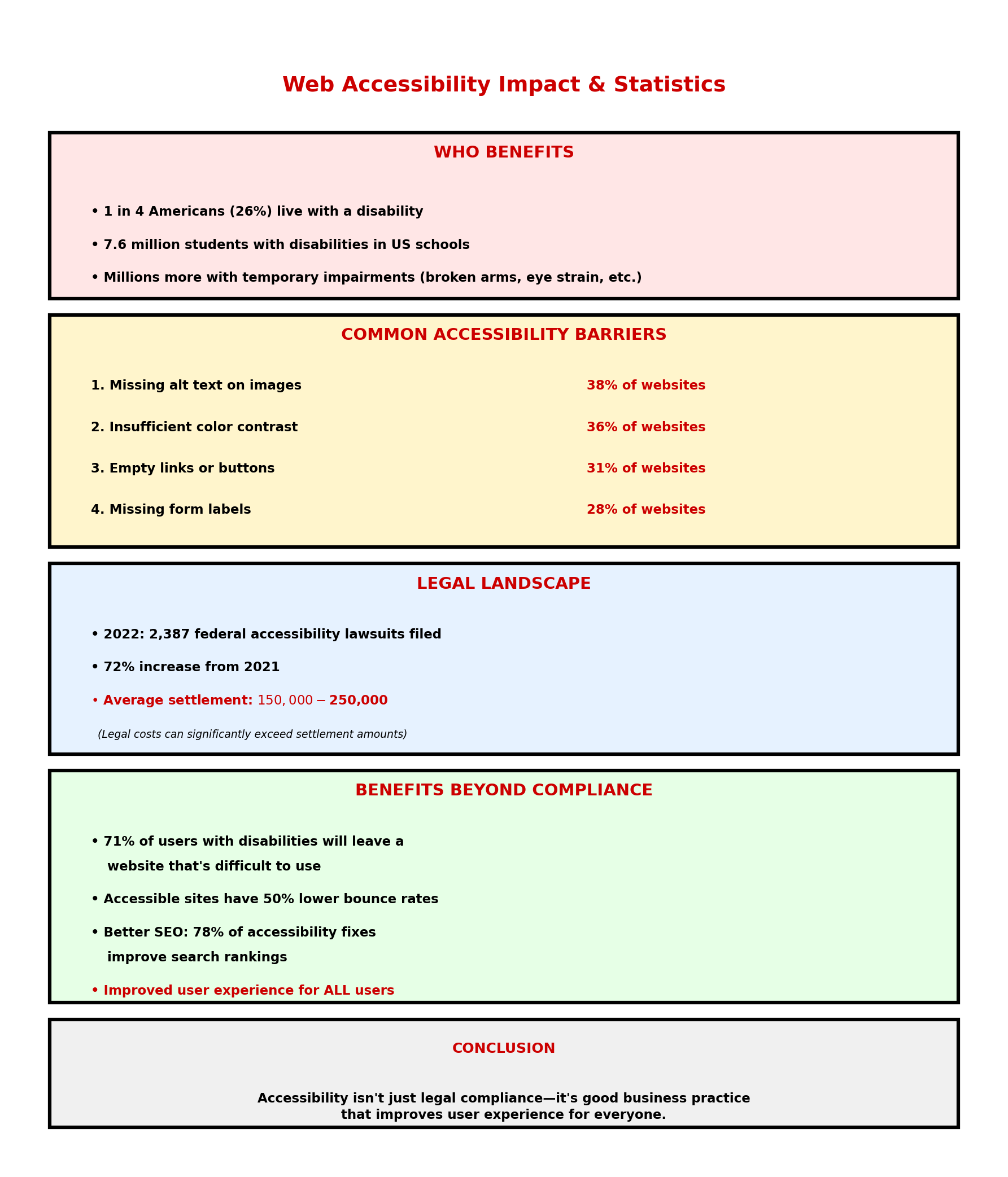
Long Description:
Web Accessibility Impact and Statistics:
Who Benefits:
• 1 in 4 Americans (26%) live with a disability
• 7.6 million students with disabilities in US schools
• Millions more with temporary impairments (broken arms, eye strain, etc.)
Common Accessibility Barriers:
1. Missing alt text on images (38% of websites)
2. Insufficient color contrast (36% of websites)
3. Empty links or buttons (31% of websites)
4. Missing form labels (28% of websites)
Legal Landscape:
• 2022: 2,387 federal accessibility lawsuits filed
• 72% increase from 2021
• Average settlement: $150,000-$250,000
Benefits Beyond Compliance:
• 71% of users with disabilities will leave a website that's difficult to use
• Accessible sites have 50% lower bounce rates
• Better SEO: 78% of accessibility fixes improve search rankings
Conclusion: Accessibility isn't just legal compliance—it's good business practice that improves user experience for everyone.
General Guidelines for All Complex Images
Where to Place Long Descriptions
Best option: Include the long description directly on the page, immediately before or after the image. This benefits all users, not just screen reader users.
Alternative: If space is limited, use one of these methods:
- Details element: Use HTML5
<details>and<summary>to create expandable content - Link to full description: Place a "View full data description" link near the image
- Data table: Present chart/graph data in an accessible HTML table alongside the image
- aria-describedby: Reference a separate text description on the page using
aria-describedby="description-id"
Essential Elements of Long Descriptions
- Context: What is being measured or shown?
- Data: Include all relevant numbers, percentages, or values
- Trends: Describe patterns, changes over time, or relationships
- Insights: What conclusions can be drawn from the data?
- Structure: Explain how information is organized or grouped
- Comparisons: Highlight significant differences or similarities
<figure>

              <img src="chart.png" alt="Line graph of enrollment trends 2020-2025">

              <details>

                <summary>View full data description</summary>

                <p>Enrollment increased from 35,000 in 2020 to 42,000 in 2025...</p>

              </details>

            </figure>